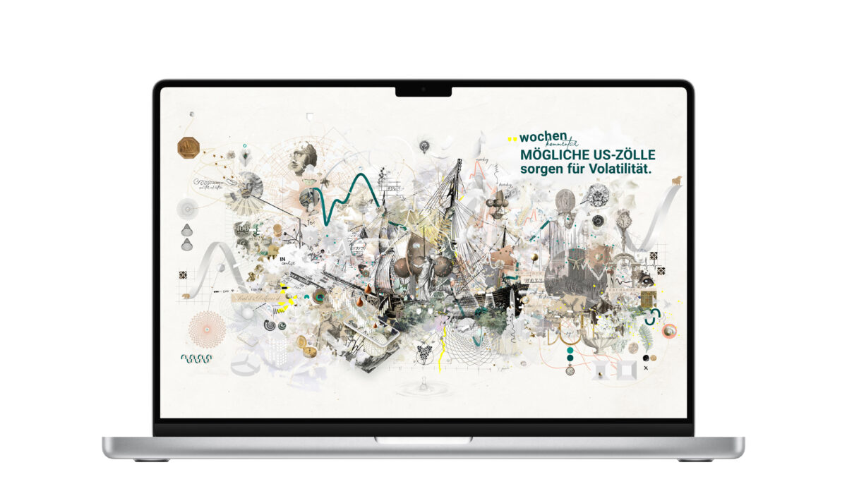
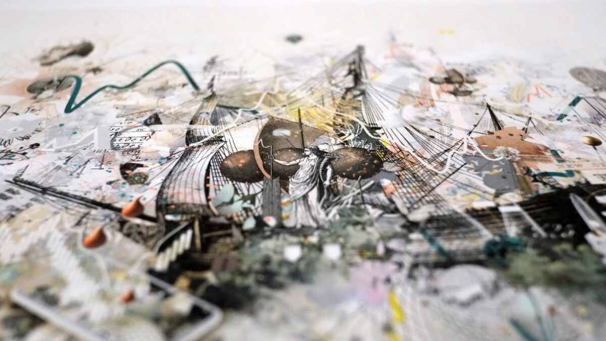
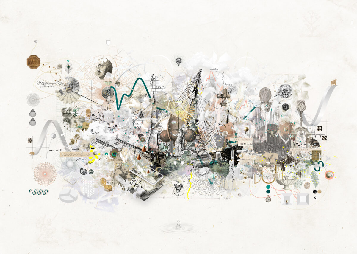
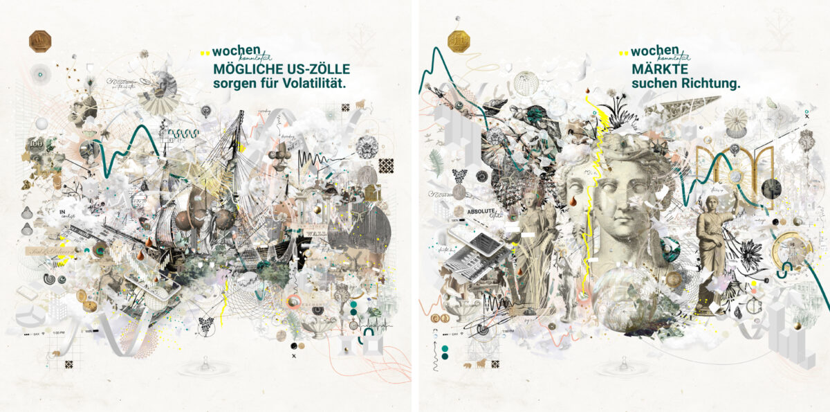
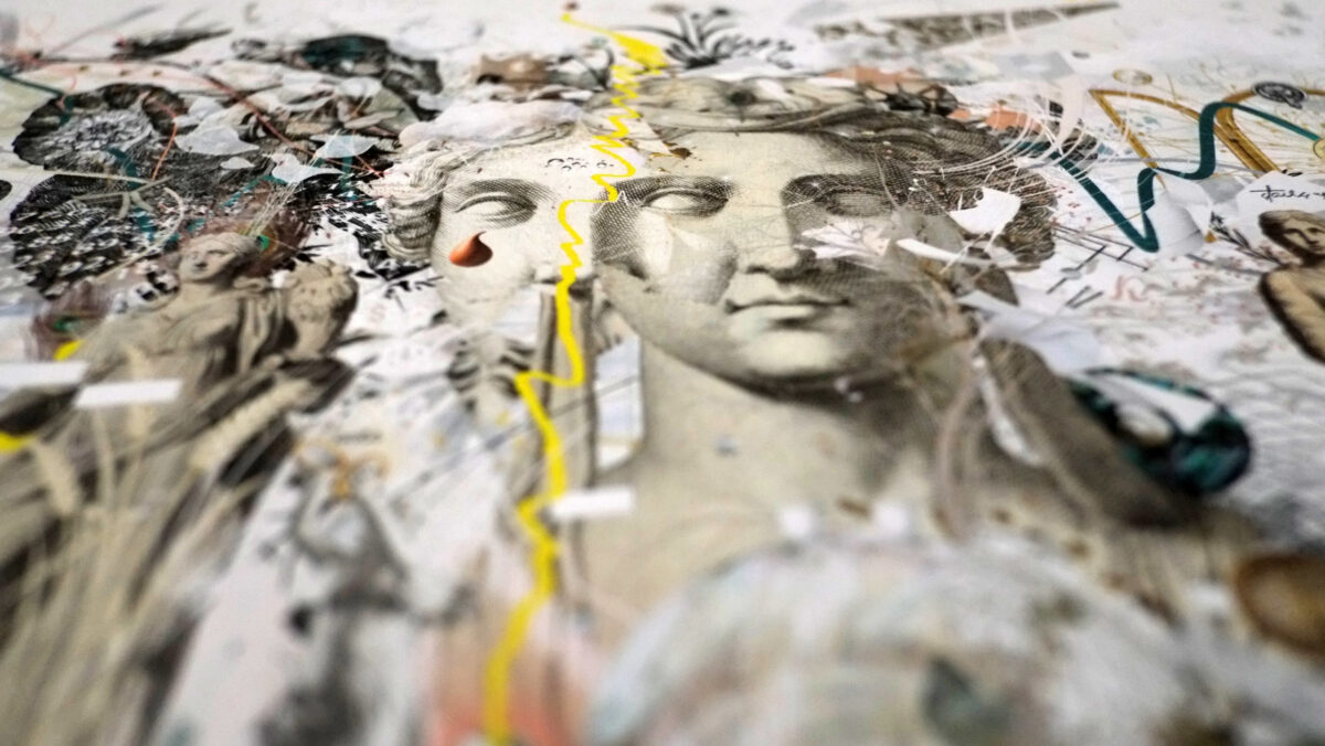
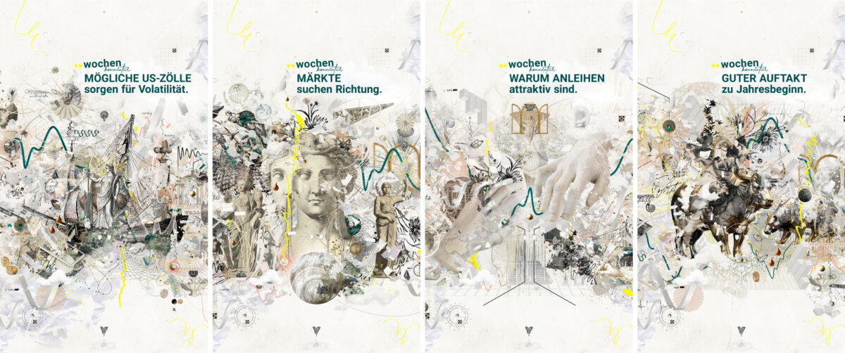
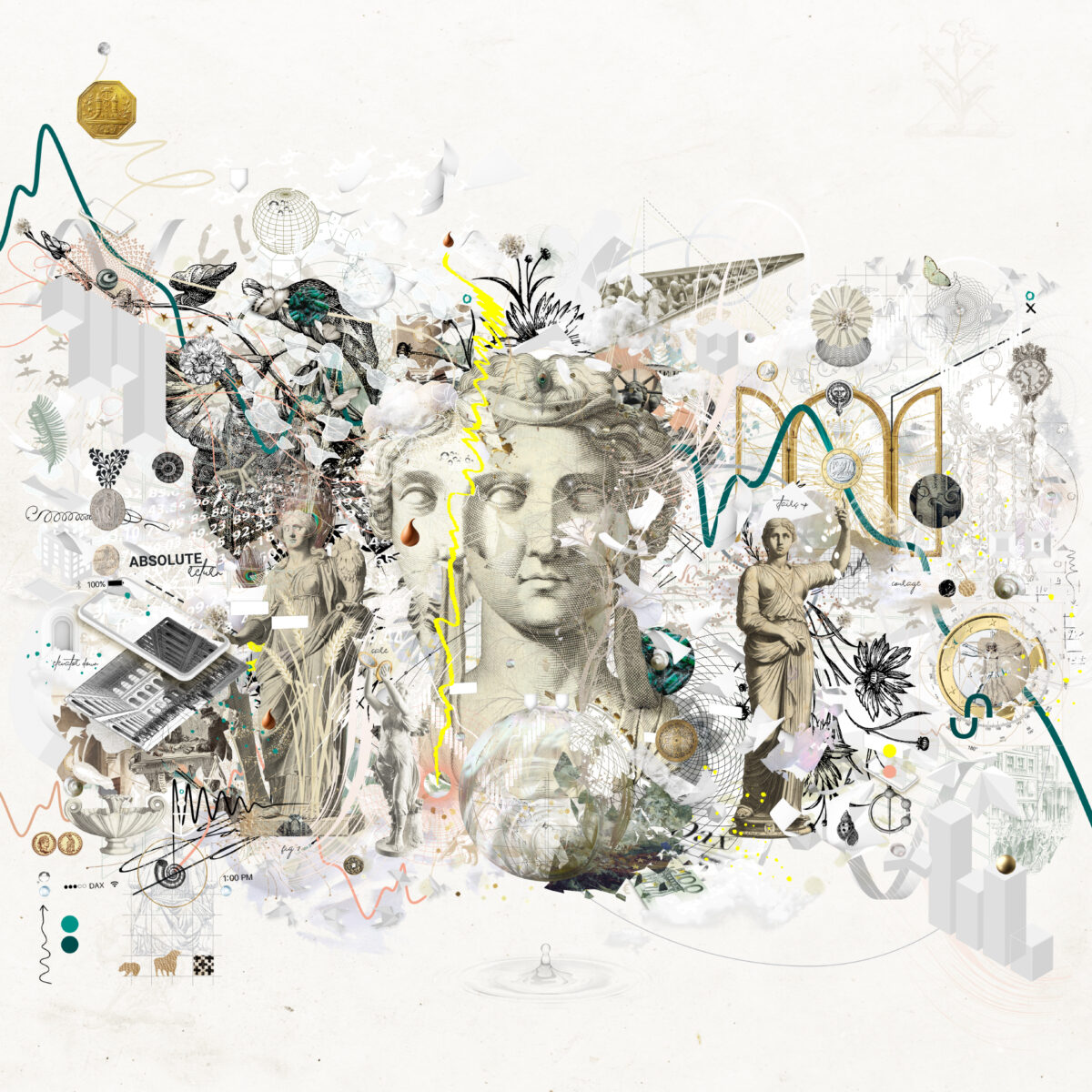
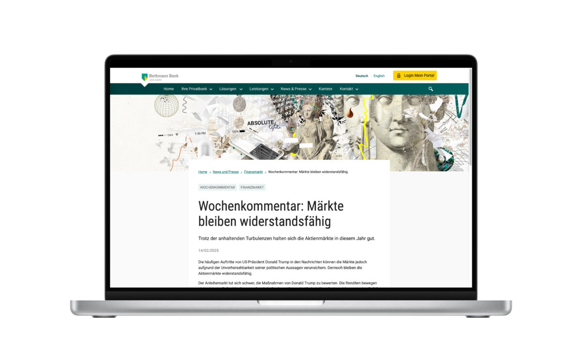
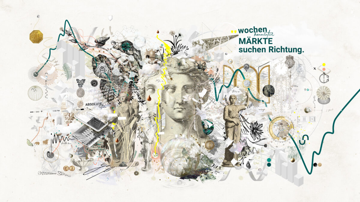
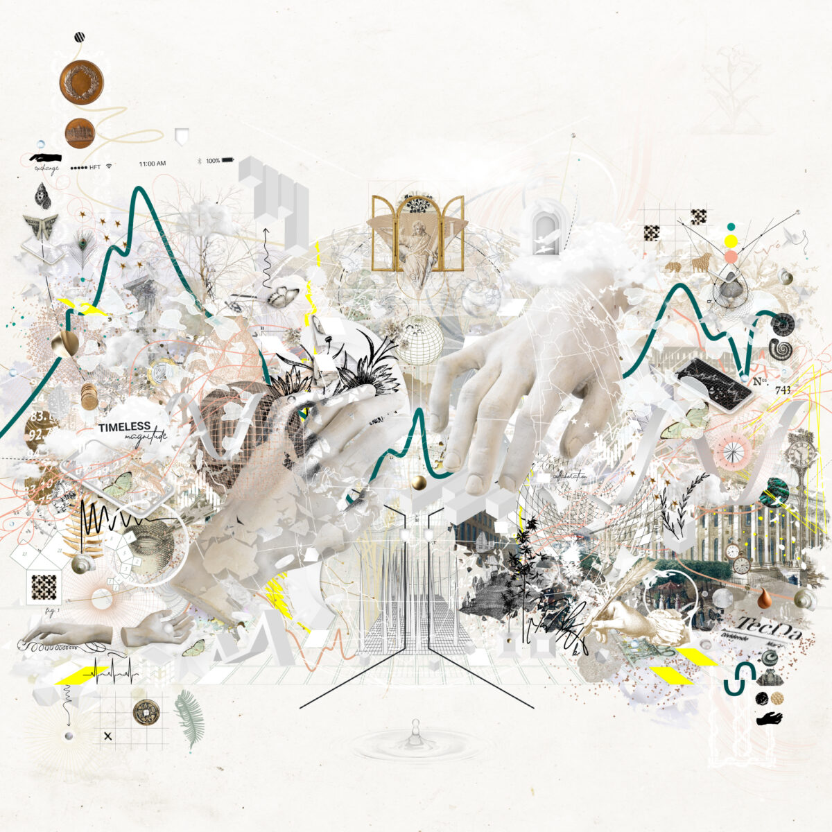
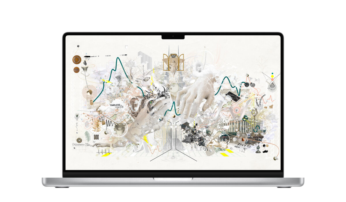
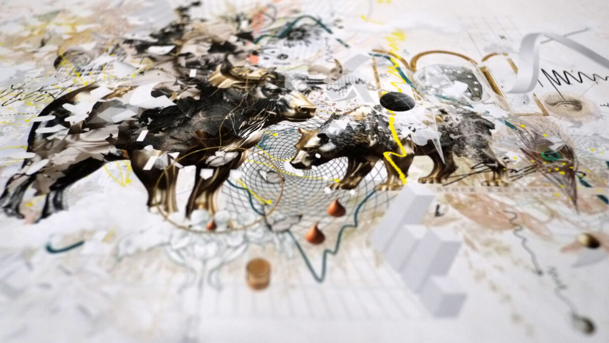
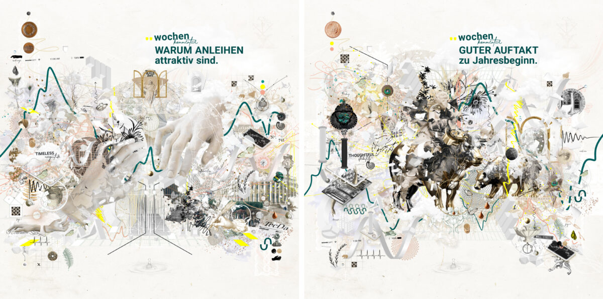
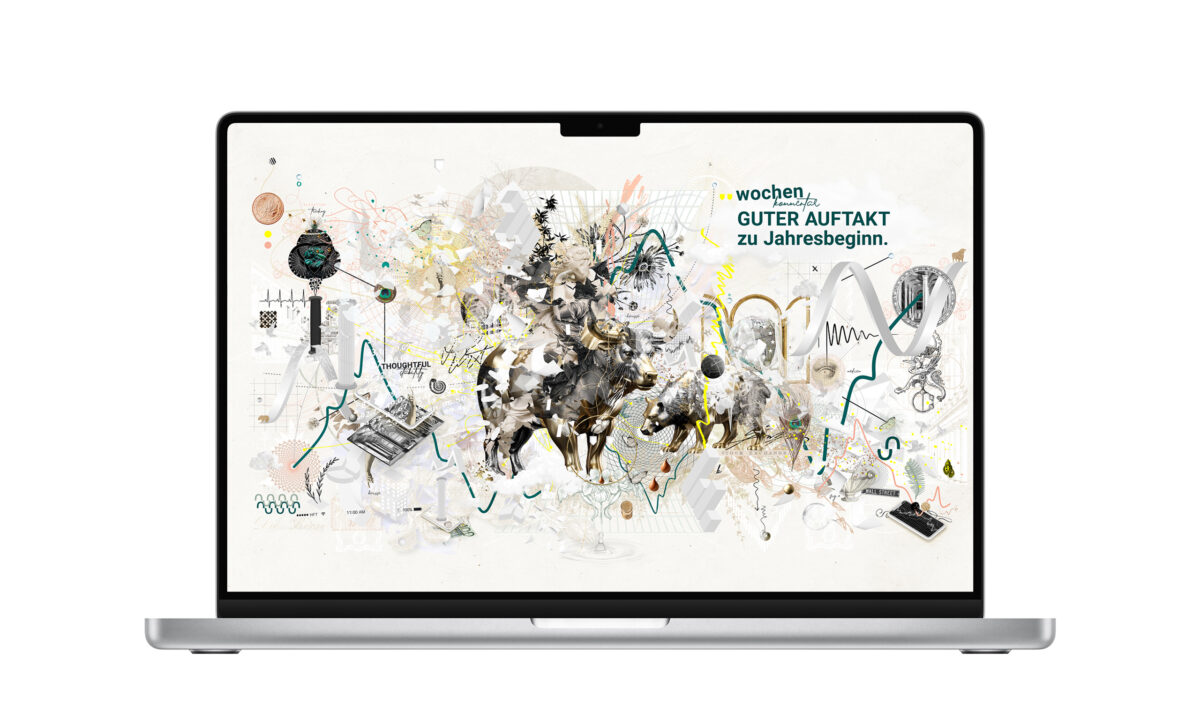
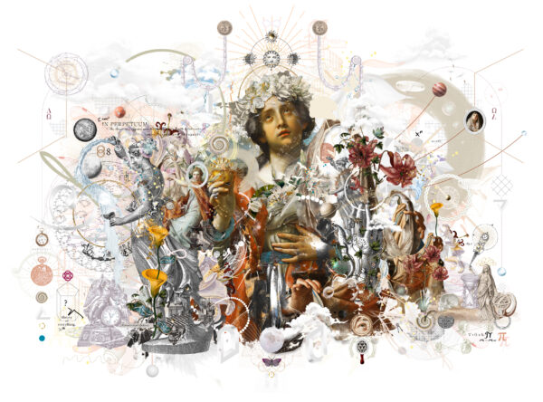
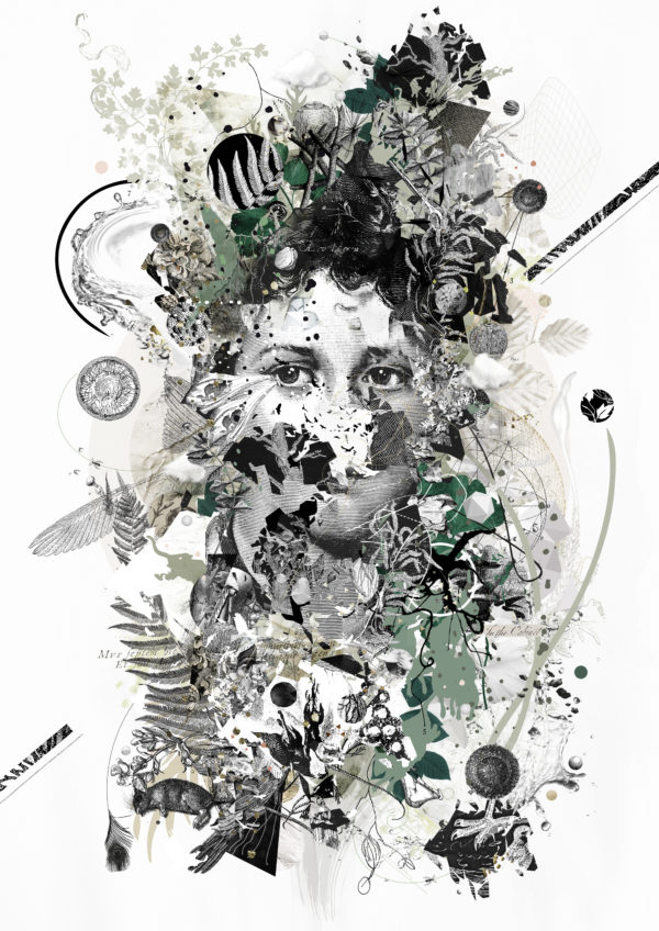
*2025 started with entering new terrains. i am grateful for the commission of bethmann bank, founded in 1712, therefore one of the oldest private banks in germany. the bank is fortified with a fascinating history & background. i appreciate that sustainability is one of the core ambitions & values. for the weekly online column on the financial market named ‘wochenkommentar’, i developed a generic series of four timeless keyvisuals with character for on & offline demands in different formats. for the series i enhanced the corporate color palette for some highlights, worked with the corporate webfont & added darlington a beautiful signature typography as personal twist & balancing ally. the shape of the corporate logo icon also found it’s place. just to give an insight on some basic facts. when it comes to the visual language of stock markets, bank institutes, financial services, observable & for a reason there is most of the time a minimalistic, sleek approach & requirement focusing on serenity & information. sometimes it is nice to take courage & come up with something against the stereotype expectation. i took the possibility to look at the topic from different perspectives. as visual tale & story teller i am always up & into new adventures, diving into insightful research is one of my favored passages during the creative process. entering the playground of the financial market & transferring things into artworks was a delight. the tradition of market places, trade in general, the symbolically charged finance & stock buildings of the past & the now, their rich decor with mythological statues, busts, columns, ornaments. the detailed beauty of banknotes & coins. the ups & downs of stock market curves, related in my mind with seaside & tides. my studioship took reverse course in history and recovered merchant ships & harbours, hands in collaboration holding together, pushing forward & reaching out, the bull and the bear, europe & justitia, revived busts as timeless monuments of human kind, a perambulation of infinite portals of possibilities. the task was also that the sujets should be timeless & fit the variety of financial tidings and multiple on and offline purposes. any time a sujet appears, beholders are able to discover something new. so it is little stories hidden in the lead story. sometimes it needs fortuna/tyche to get commissioned with a phantastic project like this. merci to bethmann bank for the trust, the wonderful briefing, feedback & communication culture. thanks to felix schrader senior manager of communication & practise. avec pleasure.♥︎
client | bethmann bank ABN AMRO bank N.V. frankfurt branch
corporate design | provided & (c) by bethmann bank
keysujets technique | mixed media collage & illustration digital
typography | roboto by christian robertson, darlington signature by glyphstyle

